CONNECTING WITH STAKEHOLDERS
This report was so well-received that it prompted one reader to make a significant donation to the hospital.
ANNUAL QUALITY REPORT
New England Baptist Hospital
28-Page annual report
CHALLENGE
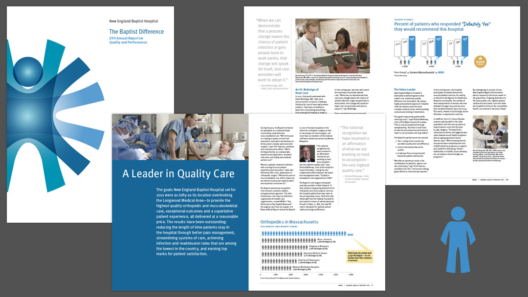
Combine the historically separate annual and quality reports into a single, comprehensive report featuring innovations in care, patient success stories and critical data such as infection and readmission rates.
This represents a dramatic shift in how the Baptist presents its achievements, and puts forth the design challenge of appealing to readers of very different business perspectives, including the medical community, patients, insurers and donors.
SOLUTION
- Engaging info graphics work on multiple levels to quickly convey overall trends as well as very specific data points
- An icon in the style of the logo mark appears in several graphics as a reminder that the hard data is all about patient care
- Pull quotes, sidebars and patient photography add visual interest and reinforce the patient connection
- Sans serif typography provides a clean look that reflects the Baptist’s state-of-the-art care and innovations
- In celebration of the Baptist’s new visual identity, the logo is highlighted on the cover with spot gloss UV coating
MY ROLE: Interface with client, concepting, design, info graphics, print management
