Natalie immersed herself in my project and photography – she really got a sense of how I work and what I wanted my book to become. The result was a typographic treatment and design approach that brings out the best in my images. It’s better than I could have imagined!
Andrew ChildBOOK DESIGN
Andrew Child, Photographer
Havana: Light Beyond Vision
CHALLENGE
Showcase a fine art photographer’s unique approach to capturing the colors of Havana through panoramic infrared photography.
Deliverables include “idiot proof” templates, consultation, design review of final pages.
SOLUTION
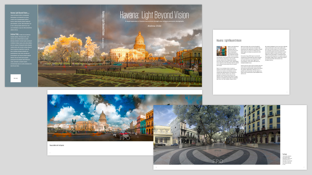
Understated, streamlined typography supports the photography’s tone and composition:
- Subheads and image titles are set in a compact font having an unusually open and airy presence, reflective of the quality of light and atmosphere captured in the photos. The density of the font provides a rhythm that works well with the panoramic image format.
- A sans serif typeface with a large x-height provides a nice, even, very readable texture for the body text.
- Generous leading allows an extended line length to mirror the panoramic format.
White space frames the images, allowing them to “breathe”
A 6-column grid allows flexibility to accommodate different photo dimensions and compositions
MY ROLE: Interface with client, design, templates, final review of client-generated production files
